The goal of this branding is to bring the identity to the core idea of the brand — being honest, transparent, and stripped down to what really matters. I focused on creating a system that feels fun, modern, and true to the rawness of real fruit.”
01
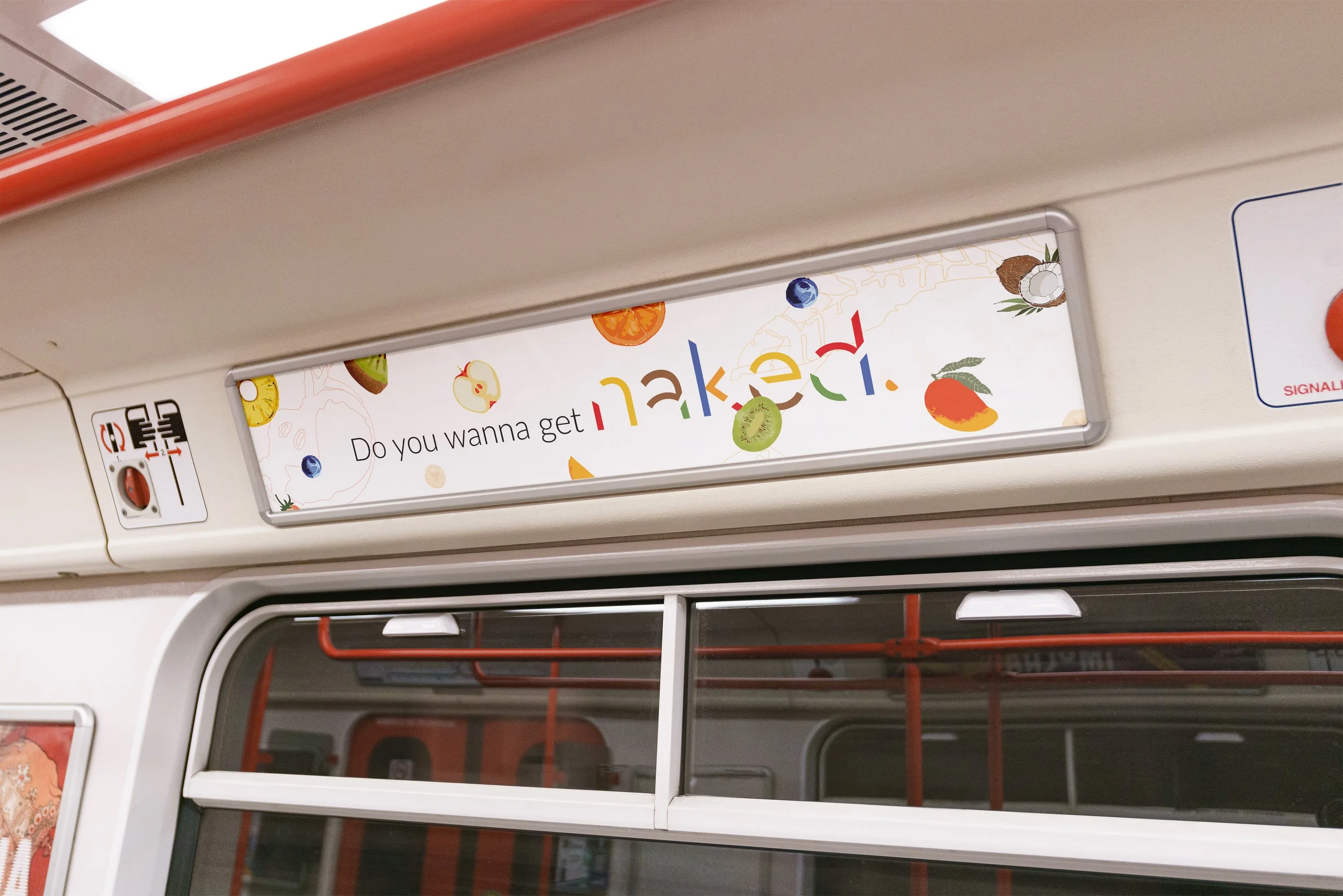
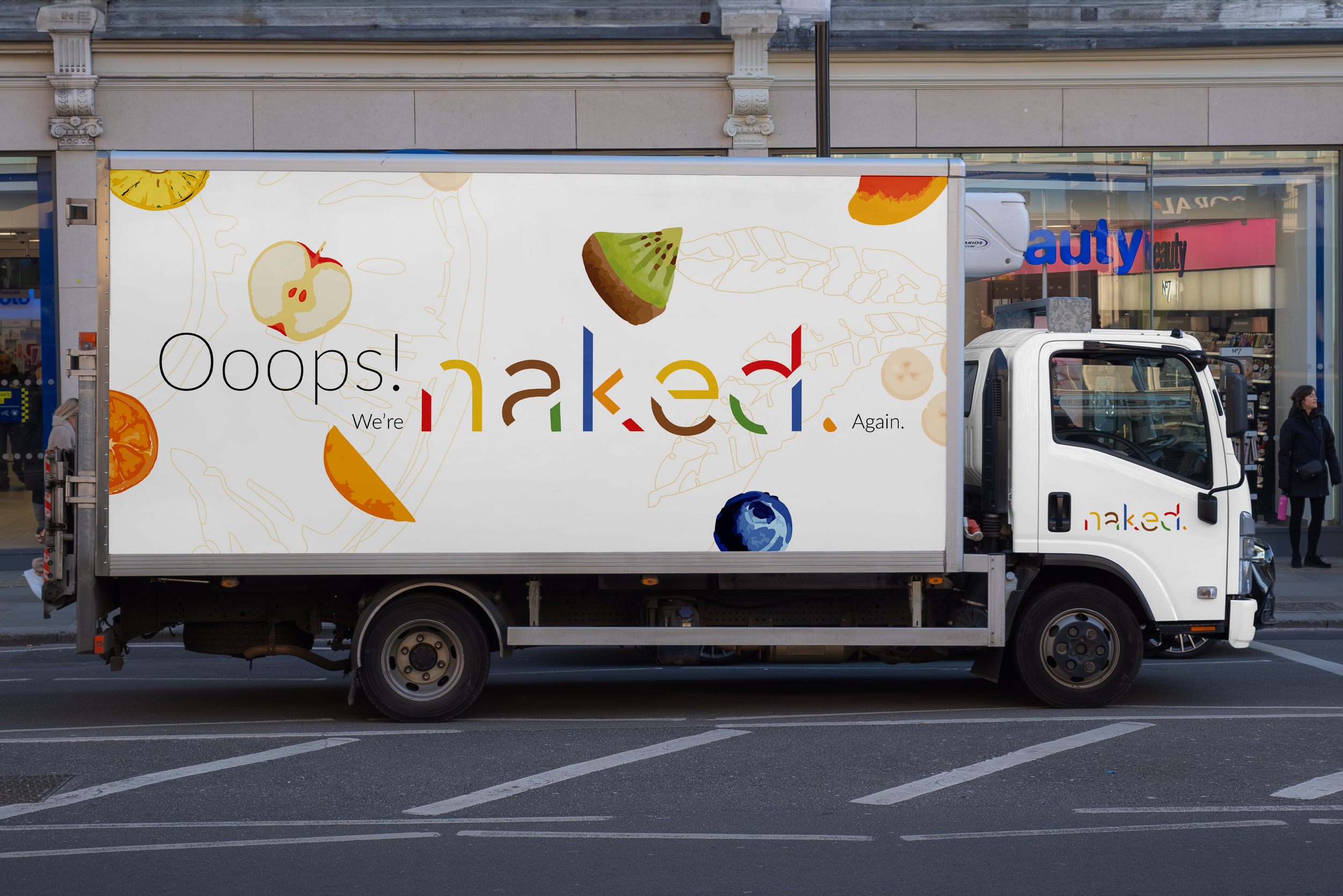
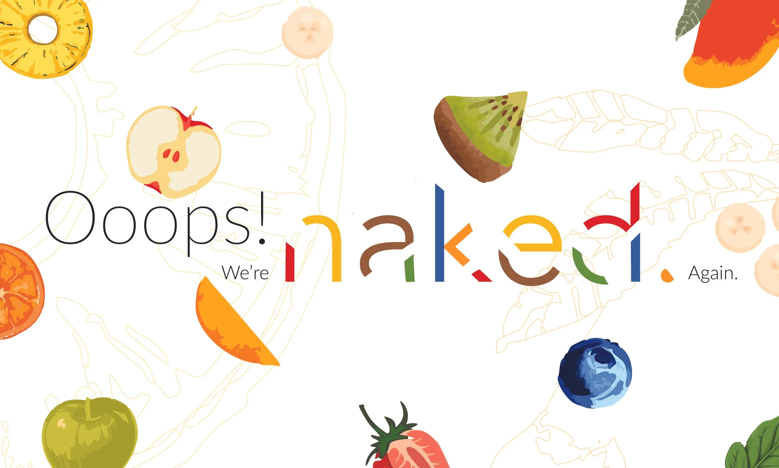
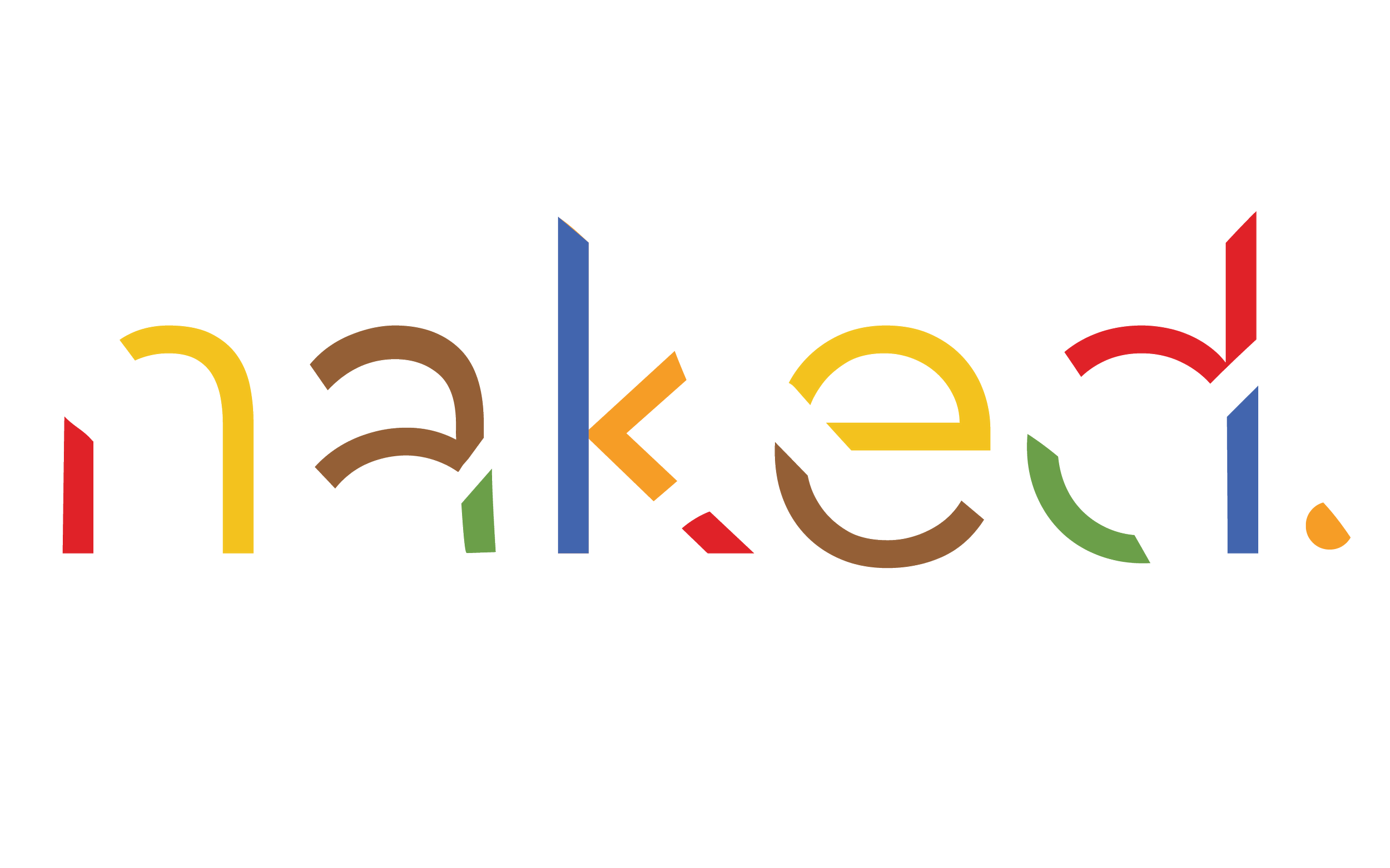
Logo
This is the final logotype. Each letter is built from minimal, color-coded strokes that reference fruit flavors without directly showing fruit. The negative space allows the viewer to complete the forms. It’s simple, confident, and playful — exactly what Naked stands for.”
02
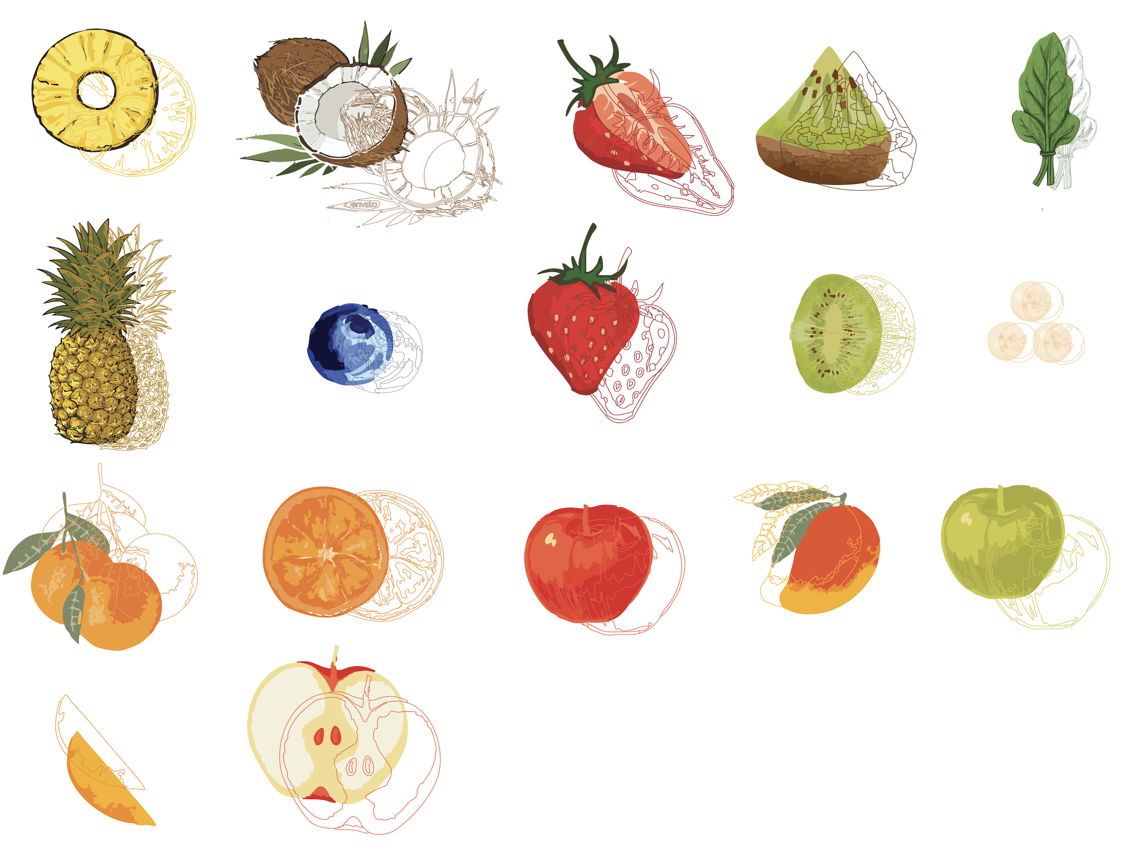
Secondary Graphics
03
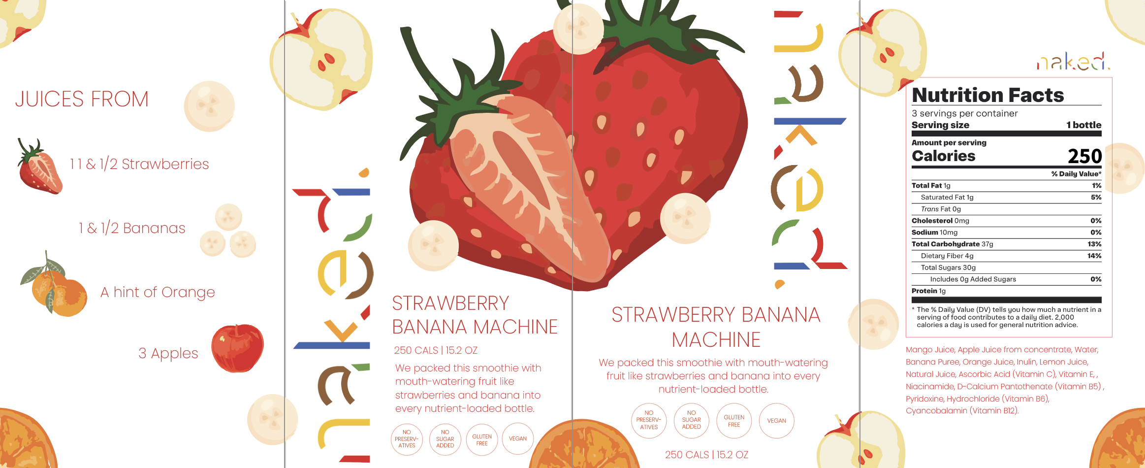
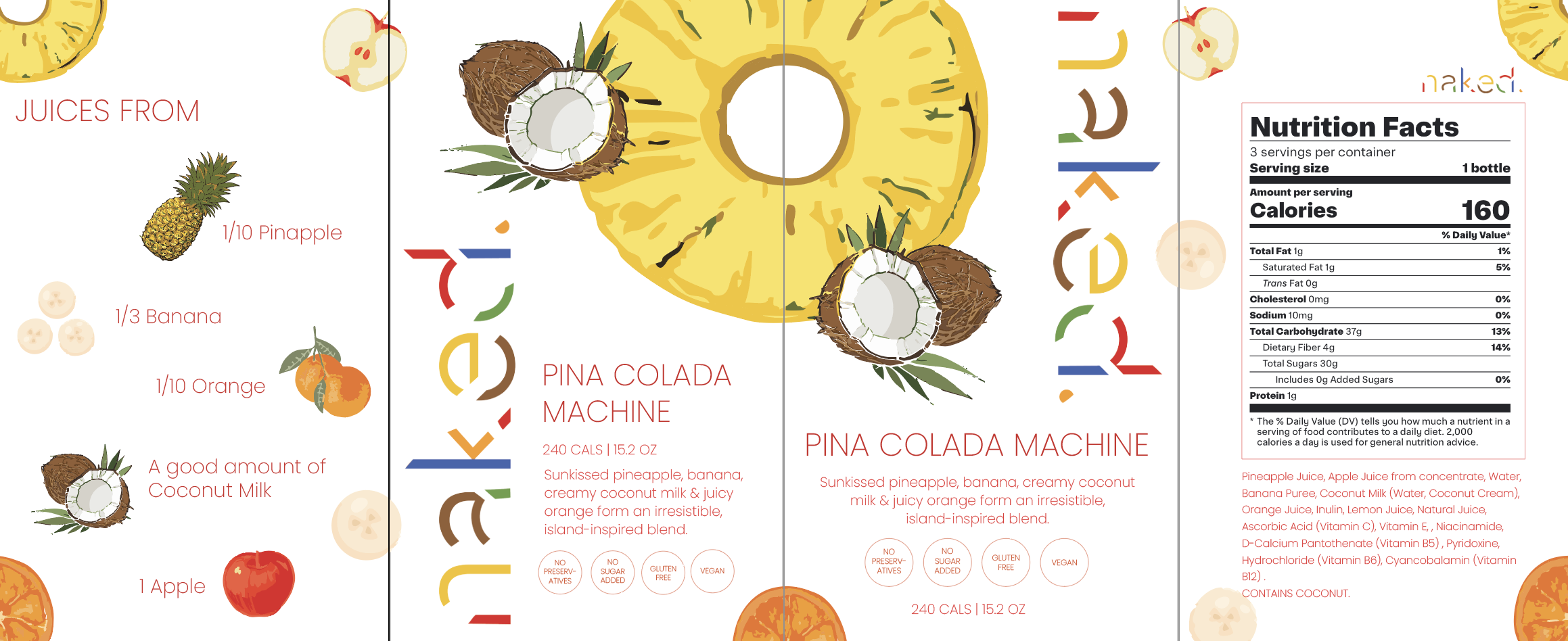
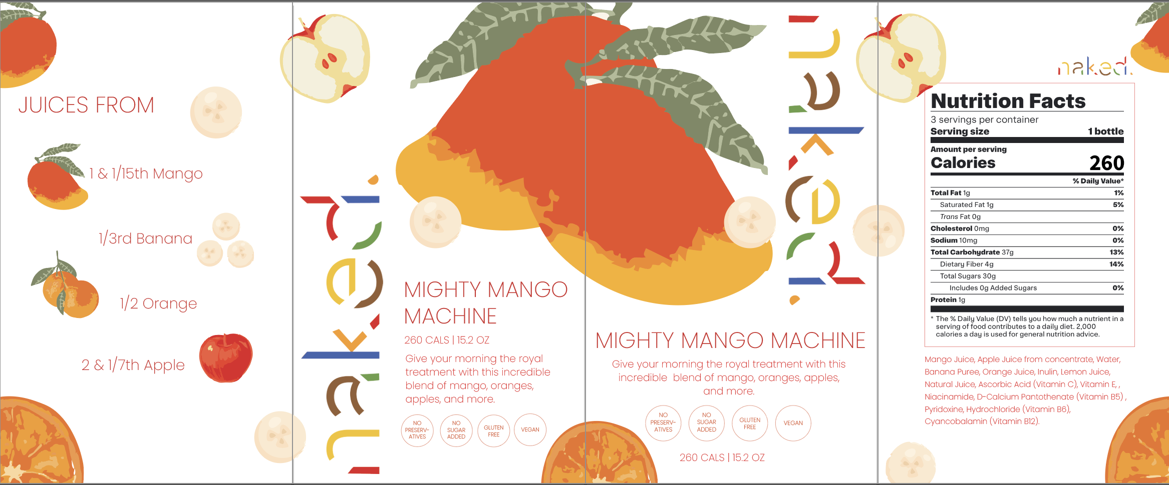
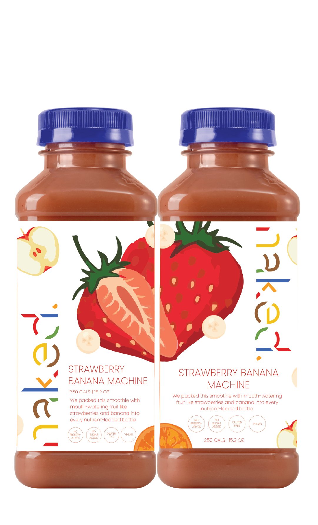
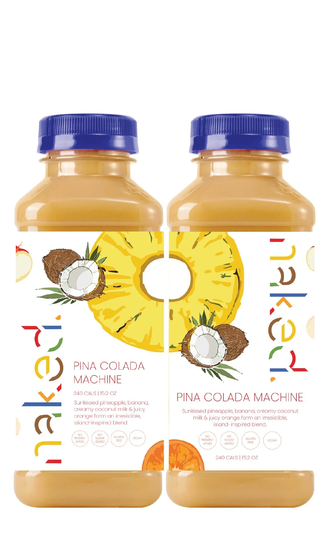
Packaging
04
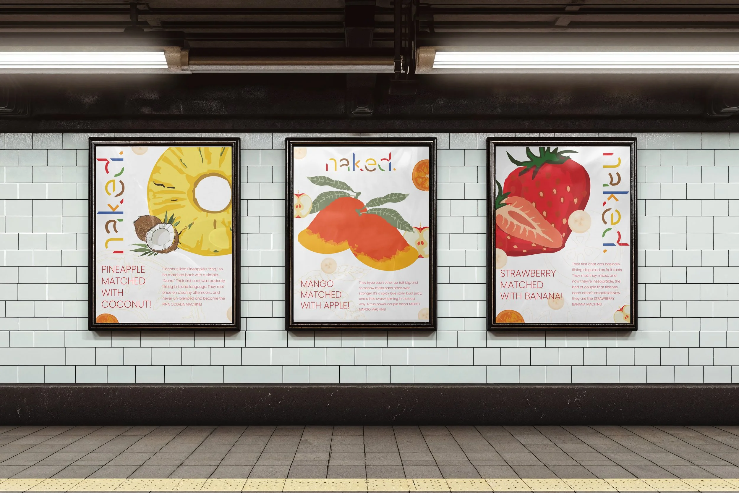
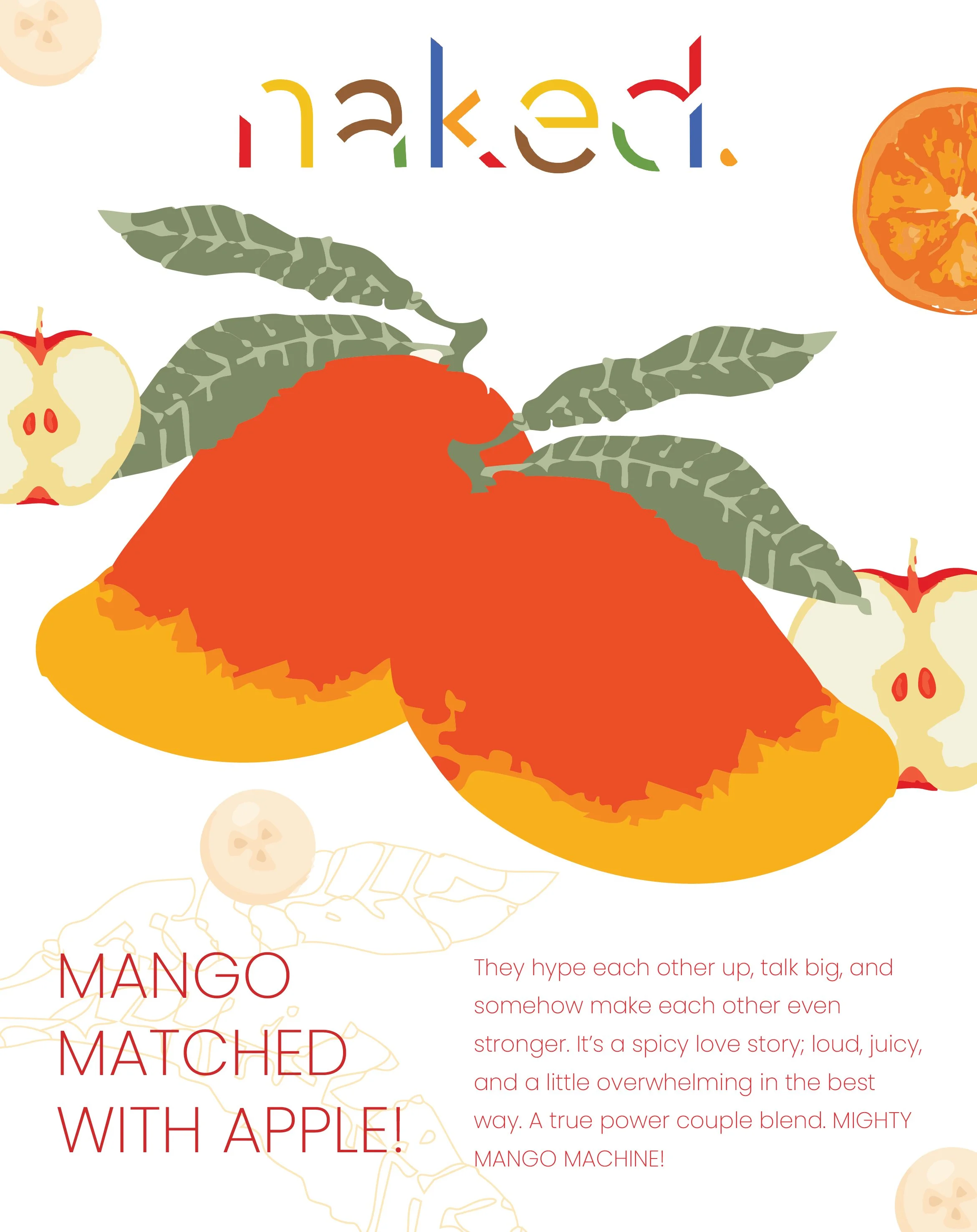
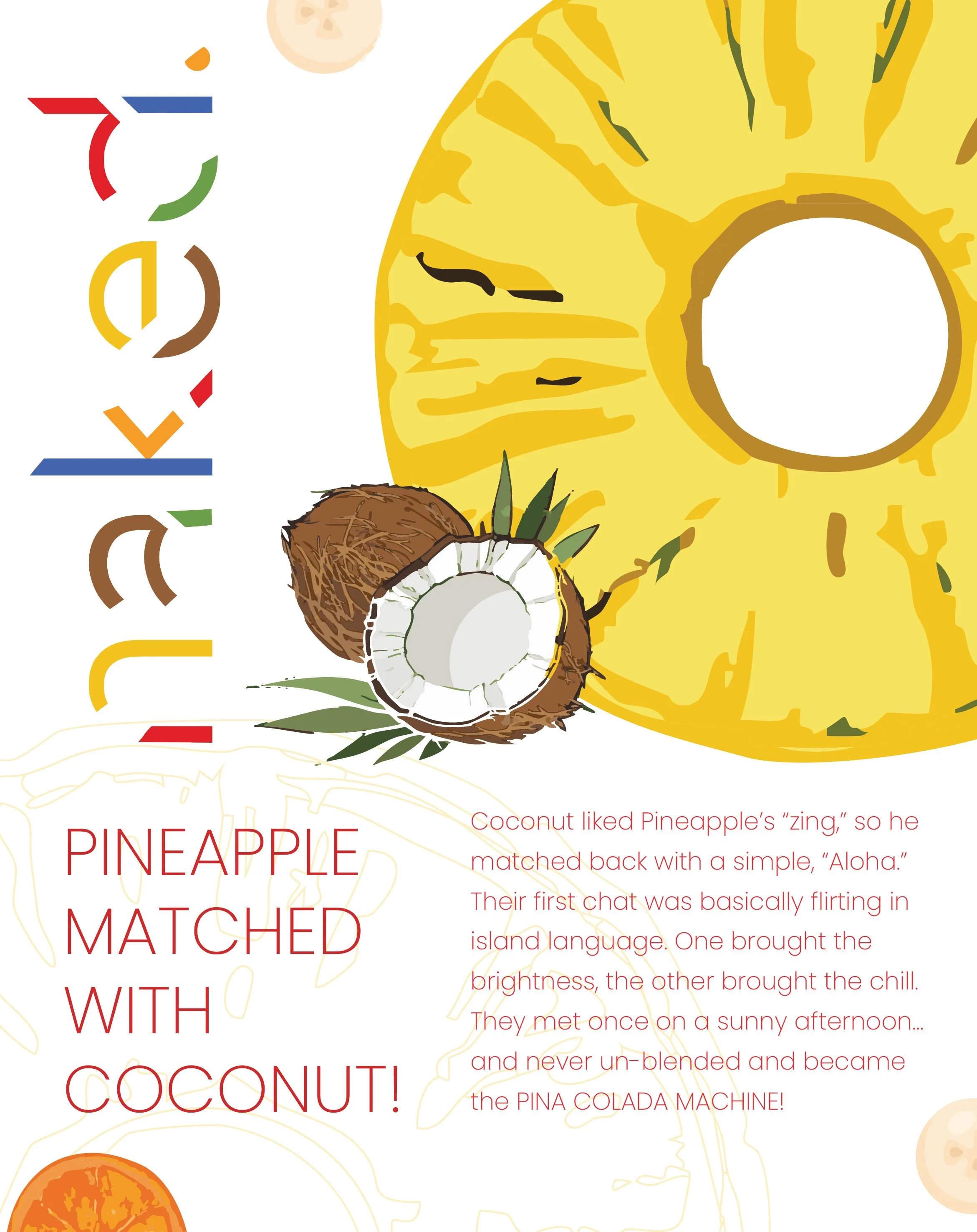
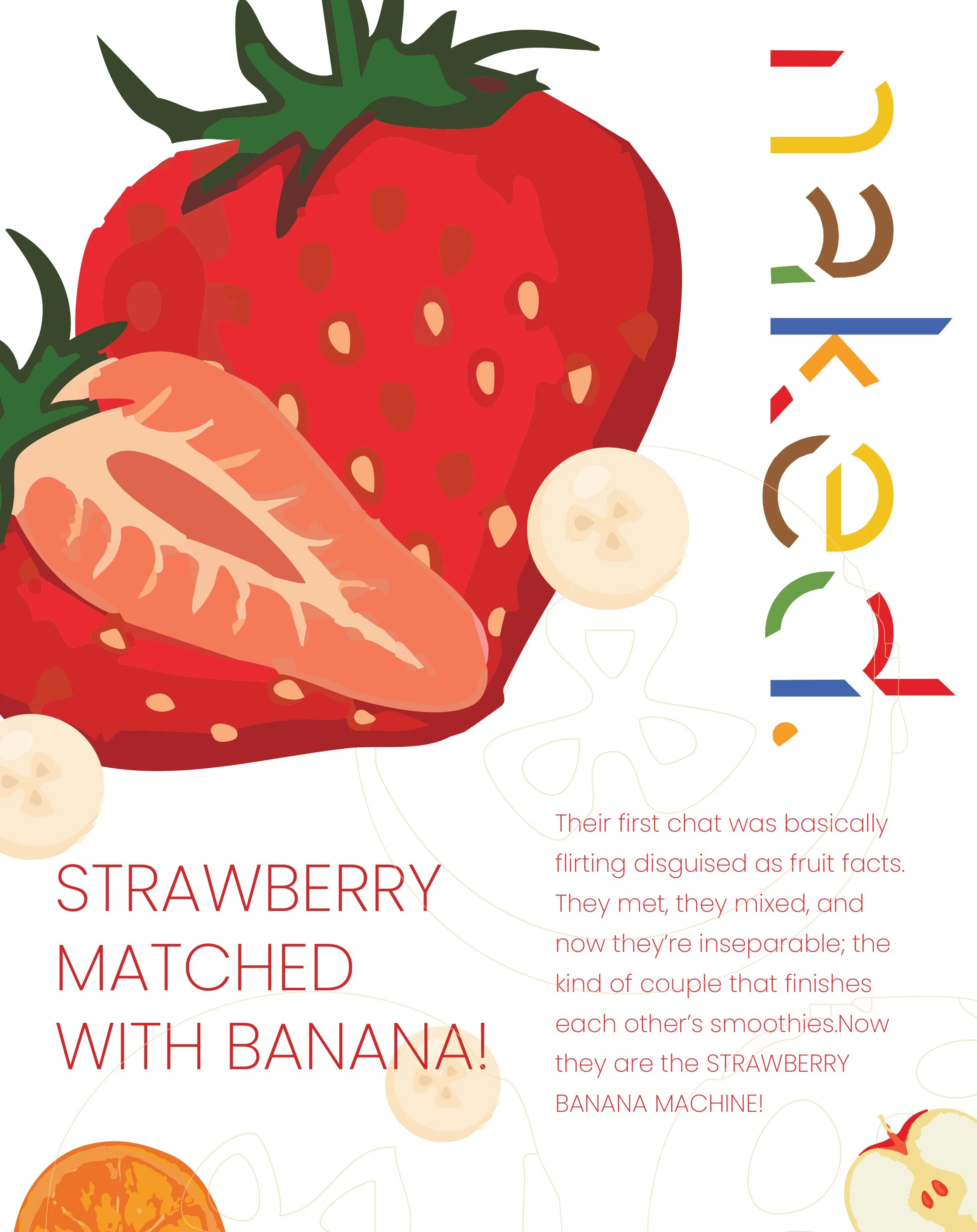
Posters